Confession: I have been avoiding green for years now
A story of nature and colour and how your roots can influence you in unexpected ways.
They say that you cannot choose your family or where you are born. And even years later the environment that you grew up in, has an influence in how you see and process the world around you. This story starts in childhood and grows from there. It is a story of nature and colour and how where you come from influences you in ways that you wouldn’t expect until you find yourself in a different place.
I grew up in a small town in sunny South Africa. I say sunny, because it is significant. Sun means blue skies. Something that is an almost constant in that part of the world. I remember lying on a blanket looking not at the blue sky, but into it. How one’s eyes would not be able to focus and a feeling of immenseness would wash over me. It’s a wonderful feeling. Constant blue skies, however wonderful that may be has a downside though. It means that it doesn’t rain a lot, and that influences the whole landscape. The trees are more thorny and you can easily see their “structure” through the leaves. Yellow ochre also plays an important role in the landscape. Once you step outside it is one of the most dominant colours. If you want to find green grass, you will have to go to the neighbour who (not so) secretly waters their lawn while there are actually water usage restrictions. (So in this case I guess the grass might actually be greener on the other side.)
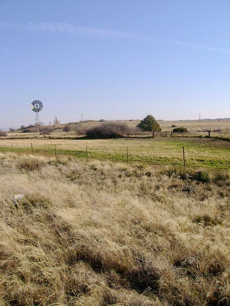
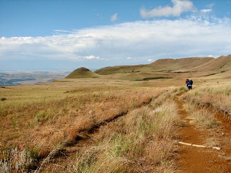
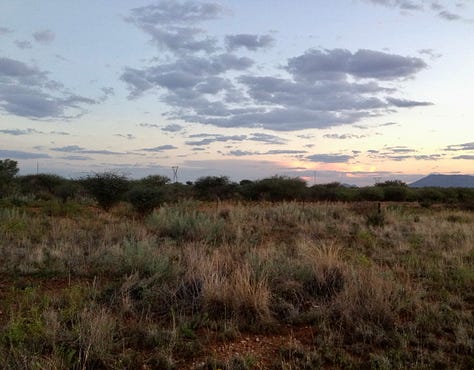
The view from my childhood bedroom window was of a mountain. It was blue and brown and rocky with a few thorn trees and bushes around the base of it. The first time I saw mountains covered in pine trees was when I drove the blue ridge parkway (USA) with my dad during a work trip of his that I was fortunate enough to tag along on. Somehow, before that, I could never have imagined that mountains could be completely covered in trees. All that green!
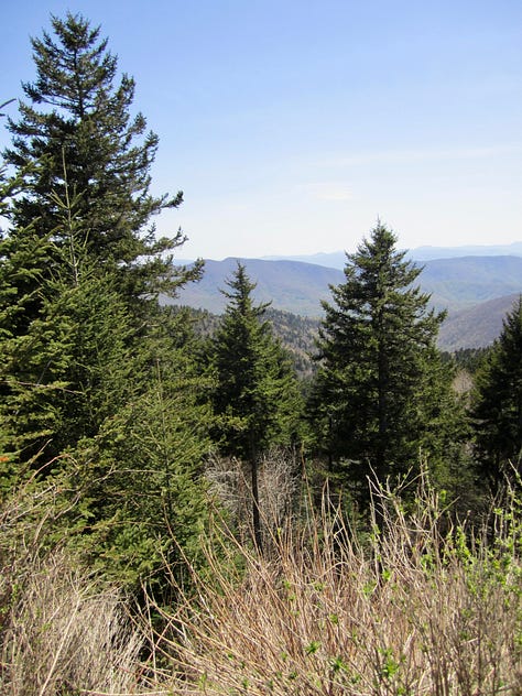
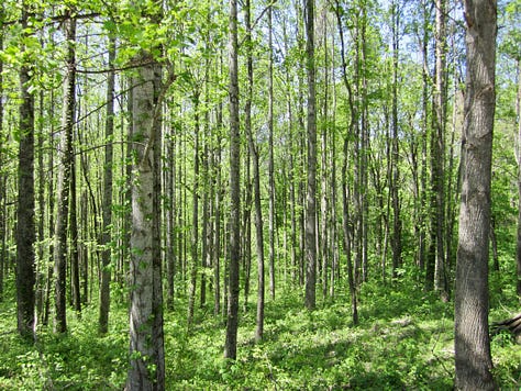
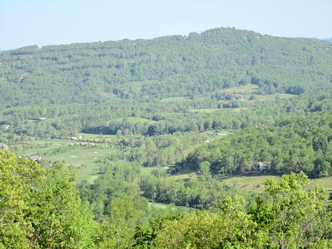
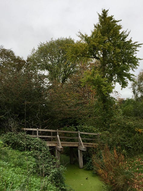
Fast forward a few years to after we moved to the Netherlands. I remember walking in the city center of Haarlem, crossing canals and rivers, and thinking, “All that water!” I was spellbound. There was a severe drought in South Africa just before our move, with water shortages and water restrictions. Cape Town had a count down clock to day zero, when the taps would all run dry. Some towns actually did run out of drinking water. Green was nowhere to be seen. Not even the garden obsessed neighbour dared to water their plants. How different it was in the Netherlands. Suddenly all the blue and yellow ochre I was used to, was replaced by grey skies and green everywhere. I did not know what to do with it. Give me a desert, the wide open plains or a rocky mountain and I could sketch it for you. Knowing which colours to use came so easily. But now it was all a million different shades of green, with dark grey skies and english-red brick houses. And I avoided sketching it like the plague.
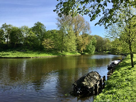
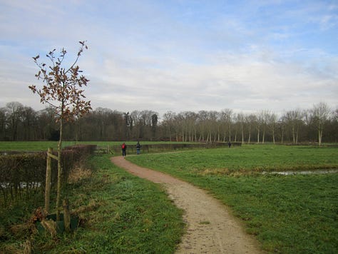
In 2019 I went with my Dutch language class to an exhibition at the Teylers Museum. It was called ‘200 Kinds of Green’ and showcased the botanical studies and art of Franz and Ferdinand Bauer. Was it amazing? Yes. Did it inspire me to start to sketch with green. Quite the opposite. It was just too overwhelming, being confronted with the idea that there was 200 different shades of green in nature.
“It was just too overwhelming, being confronted with the idea that there was 200 different shades of green in nature.“
When we visited Austria in 2022 I was determined to sketch the mountains and lakes. Even though I knew there would be a lot of green, I was still caught off guard. And I was frustrated. Although there were some successful sketches, many of them weren’t what I wanted them to be. When I got home I was determined to figure out how to draw and paint green landscapes. I am still on this journey, and I must admit that I am starting to really enjoy it. But that only started to happen after one seemingly insignificant thing happened.
A sanguine coloured marker that wasn’t packed away as it should have been.
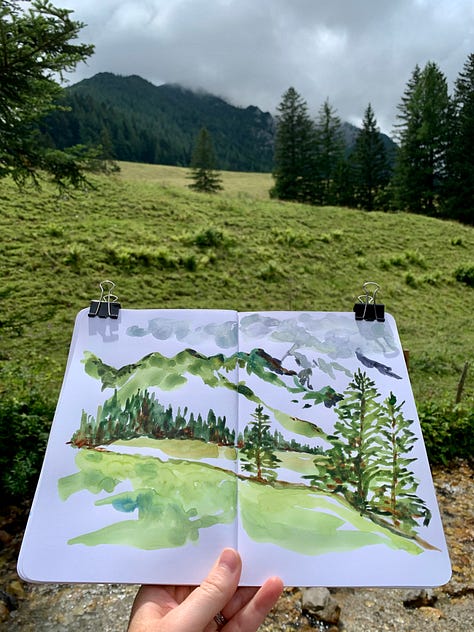
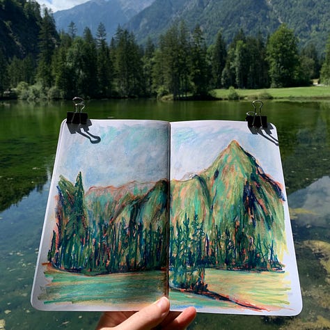
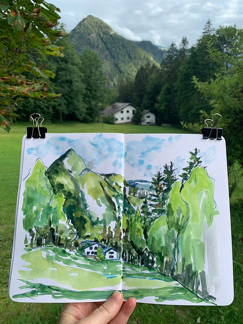
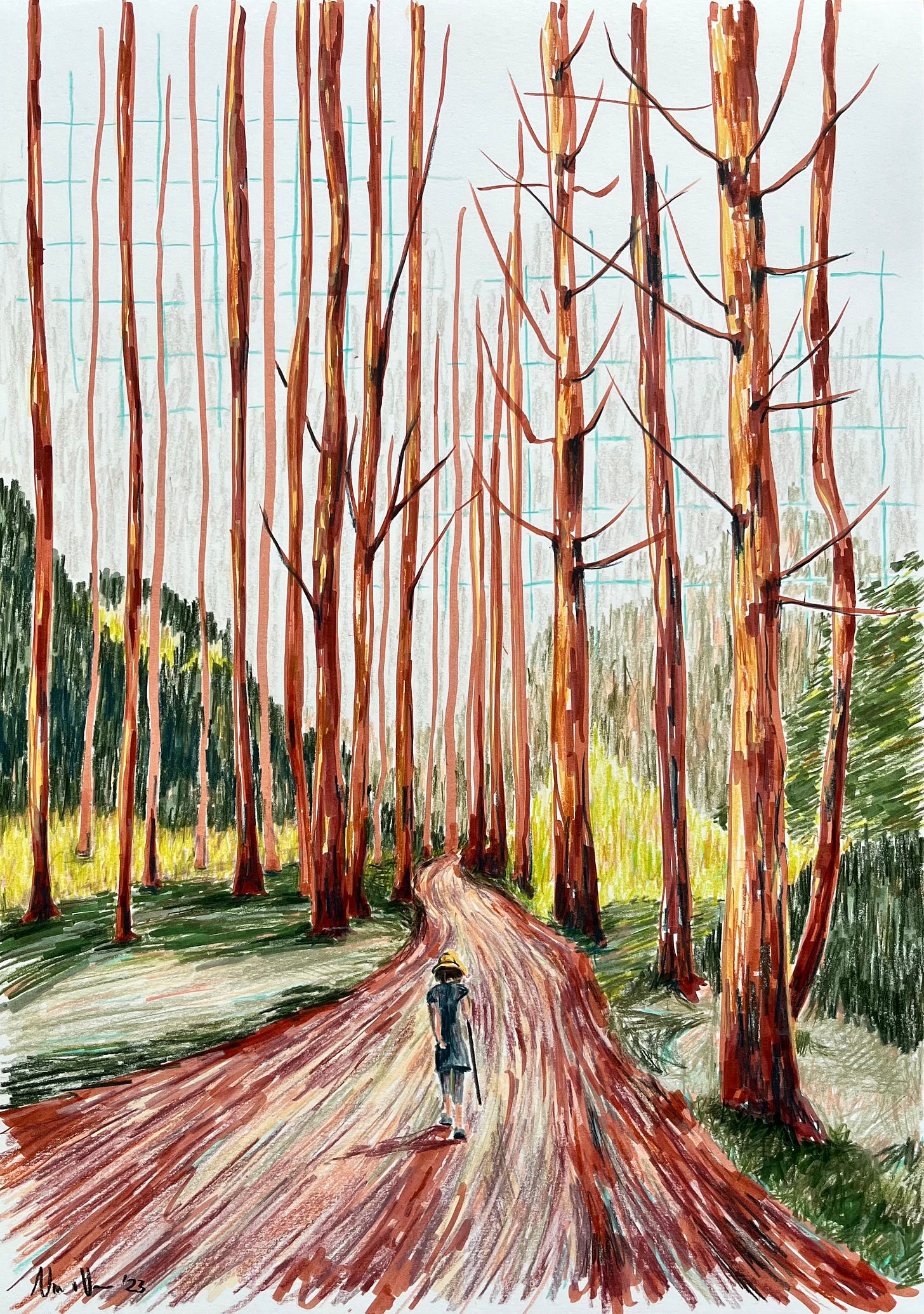
There was this sanguine coloured marker lying on my desk. I don’t even know why it was lying there. It should have been packed away with all of my other markers. And I just felt so drawn to creating something with this marker. To me, sanguine is a colour that is filled with such raw emotion, and I have always found that I can express emotion much better in colour and sound than in words. And this colour was screaming at me to use it.
“To me, sanguine is a colour that is filled with such raw emotion, and I have always found that I can express emotion much better in colour and sound than in words.“
I found a photo that I took when my family and I were hiking in Austria, and decided that that would be the photo to draw from. I started to build up the colour palette that I wanted to use, starting with the sanguine marker. A cinnamon coloured marker being the first addition. I even went to the art supply store to buy three more green pencils of different shades.
And as I was doing this drawing, something started to click. I started to realise that drawing with green was less about the green, and more about all the other colours that you use with the green. The sanguine and cinnamon and purples. I started to figure out that it was those other colours that determined whether the scene was a spring, summer or autumn green. For spring the pinks work so well, moving on to the magentas for summer and the rusty colours for autumn. I am not yet sure which colours will work well for winter scenes, but I am looking forward to experimenting and finding out which ones work once winter is upon us again.
Doing this drawing was such a breakthrough for me. It has lots of green, something that I have been avoiding for years now. And here I was using it with abandon. Since then green landscapes has become one of my favourite things to sketch. I do it almost weekly if not more than once a week. And I definitely cannot wait to go back to Austria to flex my new green sketching muscles.

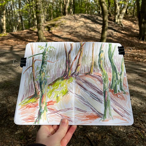
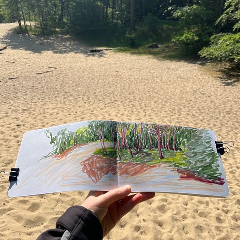
Do you have a colour that you have been avoiding using? Tell us in the comments. Maybe the community has some bright ideas on how to overcome that fear.
Explore: COLOUR! workshop entries now open!
I have good news for those who will be in the Netherlands in the beginning of September. On the 2nd of September I will do a rerun of the popular Explore: COLOUR! workshop. This will happen in Haarlem just a 5 minute walk from the station. If you want to expand your colour “vocabulary”, and be more confident using colour in your sketches, this is the workshop for you. Go HERE for all the information you need including how to sign up for it.
Hope to see you there! And in the meantime…
Happy sketching!
Nino



Nino- I love the way you say that you looked into the blue sky, not at it. So true! Nothing is more involving than the feeling of being surrounded by immense vastness. Beautiful writing (and illustrations)!
I can so relate to this! I tend to avoid greens too because I find them too much visually. I live in rural Australia and it’s often in drought with winter grey grasses, open plains and big blue skies. Thanks for helping me see the connection of where I live and my colour choices. 😍